The importance of a web site being easy to read was brought home to me through personal experience with my aging mother. As a hard core Internet junkie, I felt compelled to share the wonders of the Web with her. Unfortunately, her eyesight had diminished and reading on the Web was an unpleasant experience for her.
I literally became her human page reader and the Internet became a mother-daughter activity. Sometimes I'd copy and paste the text of articles into Word and kick up the font size to 16 to print them out so she could share articles with her senior friends who didn't have geeky daughters.
Reading on the web can be hard work for anyone, not just the elderly. Eye strain runs rampant in the online crowd. Numerous studies have shown that reading performance drops dramatically on the web.
Making your web pages more readable is smart. You not only expand your market potential by making your pages more accessible to more people, but many of the techniques that improve usability, make your pages more search engine friendly as well.
Improving your viewer's reading experience on your site is easy if you keep a few things in mind. Here are my favorite readability guidelines.
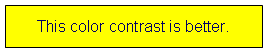
- Use contrasting colors. Text is easiest to read when the font text color and the background color are in high contrast. Low contrast irritates the reader and causes eye fatigue. Viewers with impaired vision may not be able to read low contrast text at all.
- "Chunk up" your copy. That's technical talk for make your page more scan-friendly. Large blocks of dense text intimidate the reader and cause "information overload." Look at the two pages below. Which one would you rather read?
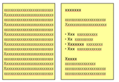
Here are a few easy ways to break up blocks of text:- Use bullets and subheadings. They help get the readers attention and say "Hey you - this is important!" Colored bullets are an easy way to add color and visual interest to a text heavy page. Subheadings should be brief and convey a summary of the section. Too often we're tempted to use clever titles whose meaning is lost on the reader.
- Keep your paragraphs short. Breaking a long paragraph into several smaller sections invites the viewer in to read. A little white space between the paragraphs gives the site a clean look.
- Impatient visitors want to be able to glance at your page and hit the important points. You can help them by bolding important points or highlighting the text in a different color to draw their eye.
- Use columns to control text width. Your goal here is to avoid running your text all the way across the page. Pick up any newspaper. Notice how they place the text in columns. The shorter width makes the text easier to read.
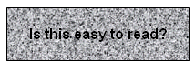
- Avoid busy backgrounds. Nothing screams "amateur" like a noisy background that makes your text impossible to read.
- Less is better. Many sites look like my kitchen table - always cluttered with things that don't belong there. The more extraneous items you cram on a web page, the more you confuse and distract the visitor. Web sites take on an unprofessional look when you start tacking on too many items. From a search engine perspective, too many ideas can dilute the relevancy of your main content. Challenge every item on the page. Does it really need to be there? Is it still functional? Can I do without it?
-
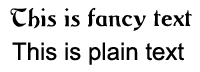
Strive for a clean font style for maximum readability. Imagine trying to read a web page in the decorative style below. Compare that with the sans-serif font next to it.
Want more font style tips? Keep these principles in mind.
- Plain text is easier to read than italicized text.
- Mixed case is easier to read THAN ALL UPPER CASE. Studies have demonstrated that it takes people longer to read upper case than mixed case. Besides, upper case has become synonymous with screaming on the web - and I'm sure you don't want to scream at anyone.
- A san-serif font is easier to read than a serif font. If you were wondering, serifs are the little marks at the end of letters. Sans serif fonts do not have serifs. Examples of serif fonts are Times New Roman and Courier New. Popular sans-serif fonts are Arial and Verdana.
- Plain text is easier to read than italicized text.
- Don't use "itsy-bitsy" font sizes. Nothing contributes to eyestrain faster than tiny font! Ideally it is recommended that you leave the font size scalable so users can control the size they want. Also some search engines might flag your site as using a spam technique if you use negative font sizes.
-
Make your links look like links. If you just can't bring yourself to color your links blue (the Internet convention for links) at least underline them. And don't underline anything that isn't a link. That faux pas makes readers mad, fast.

Summary
There are thousands of people just like my mom who have trouble reading web pages. The U.S. Bureau of the Census and the National Center for Health Statistics estimated there were 35 million seniors in 2000, that's 12.4 percent of the U.S. population. By 2007 it is estimated that 16.3 million seniors will be online. One out of five Americans currently has a disability and as our population ages that number will soar.
Improving the readability of your site is step one to opening the door of your business to a growing segment of the population. If you want to learn more ways to widen the door, check out Usability.gov.
As an Internet marketing professional, I have companies coming to me wanting me to find untapped markets to sell their goods. The answer is sometimes as easy as making your font size bigger!